Techs Must Talk to the Eyes Not to the Shoes
/Okay, visuals are perilous, bad visuals hurt presentations, and great visuals can make a great presentation much better. So, why do bad visuals happen so often? No doubt, some presenters just don’t know any better — there are cures for that. And some presenters are perennially unprepared: The worst visuals often accompany the least prepared presenters. Presenters who don’t find time to prepare aren’t likely to make time to develop good visuals either. Worse yet, unprepared presenters are more likely to have visual “cue cards.” It’s bad enough to read to an audience. But when the audience sees what the presenter’s reading to them, it’s even more painful.
There’s another big—perhaps, more understandable—reason why presenters generally, and tech presenters specifically, create bad visuals: the same visuals must often serve two very different audiences. Many presentations are first given to alive audience with the helpful guidance of a real-time presenter. Often those same presentations—or at least the slides—are sent out and left to stand alone without the presenter’s personalized explanations.
Most visuals that are clean, clear and concise enough to best serve a live presentation don’t contain enough connective content and depth to make sense as a standalone piece. In fact, those dreadful “cue card” slides almost start to make sense in the context of a slide presentation that must go forth into the world without a handler, I mean, presenter.
Very similar symptoms and results occur with highly detailed presentations where the visuals (often charts, graphs or diagrams) are over-packed, every nuance labeled or color-coded to anticipate the full panoply of questions, objections and interests an audience might present. Here, the visual might appear live or as a standalone. In both cases, it’s expected to serve all conceivable audience members in one fell swoop—rather than to present the presenter’s point as clearly and simply as possible.
Earlier, I extolled the virtues of the billboard test, specifically because it forces us to cut out all the extra stuff. It lets us know our audience can scan our visuals quickly and just as quickly come back to us. But there is no us when our slide deck gets sent ahead without us. “Just send me your deck, we can talk about it later.” Sound familiar?
We all know how often this happens. So, being smart, proactive, efficient presenters, we prepare our deck with that inevitability in mind. Suddenly, poof! Gone the nice, uncluttered visuals. Gone all care for the billboard test, 6x6 rule, etc. Soon all that really matters is packing the deck with as much data and labeling and commentary as possible to let it stand alone for individual readers. That is to say that the deck is packed well enough to render the presenter optional. In a future post, we’ll have to talk about all the many alarm bells that should go off there. But for now, let’s just look at the damage this does to our presentation visuals.
Visuals designed to help individual readers often make the live presentation downright awful. I don’t know what’s more offensive: to give an audience visuals that replicate all that we’re saying or expecting them not to notice that they don’t need us to read to them. And yet, in many cases all the informational content itself is good—important even. Presumably, it’s the very reason the presenter creates the presentation and accompanying visuals in the first place. With “cue card” slides, we fault the redundancy problems between the slide and what the presenter says because it’s unhelpfully duplicative. That is not because of the substance of what’s actually communicated.
So, too, with overly detailed charts or diagrams. It’s not that there isn’t some relevance, importance or intrigue to all of that intricate detail. It’s just that only some small subset of it can be communicated simply and clearly at any given moment — especially where the presenter is a technician and the audience is comprised of mere mortals.
Fortunately, there are some fairly easy things we can do to avoid these problems without ignoring the double-lives most of our presentations must often live.
The Notes Pane, ie, Pain
Ironically, PowerPoint, the software most of us still use to create presentation visuals, has included one solution to the problem that dates back almost to its inception (ie, back when it was “Presenter” and only ran on a Mac): the Notes pane. The whole reason for a Notes pane is to have a place for all that fulsome, non-visual information. The stuff that’s important enough to note but not necessarily display on any given slide. Ostensibly, the Notes pane is the perfect place for all the connective content and narrative to go so that it’s tied to the slide, but not imposing itself on the visual.
Unfortunately, the Notes pane is a pain to use. True, there are lots of articles that explain how to get just about any content you want into the Notes pane. There are just as many on how to print handouts that display the visual together with the notes on a page. Cliff Atkinson’s “Beyond Bullet Points” did as good a job as any advocating for this type of a workflow. But all that explaining and how-to-ing shows just how unhelpful and underdeveloped the Notes functionality remains. Over the years, Microsoft has given us helper doodads, ribbon thingys and automatic formatting whatsits that have probably kept the balance of pain and progress (though not the bloat) in stasis. But the Notes pane, that seemingly perfect place for all that important content and information stuff, hasn’t received much love and attention.
A Note to Future Users + An Appendix
David Zehren suggests that presenters include a slide with a note to future users at the beginning of the deck and add an appendix of slides at the end. The note to future users explains that the deck contains a deck of slides intended for live presentation by a presenter that is followed by an appendix of slides with more detailed information. The slides in the deck then refer (by slide number) to the corresponding slide(s) in the appendix; slides in the appendix refer back as well.
This approach provides a place where more detailed information of any kind (more text, more diagrams, etc) can go within the same deck of slides. The less detailed slides refer directly to/from the more detailed slides. This is useful and user-friendly for individual readers viewing the standalone deck. It also provides an easy way for a live presenter to take an audience on a deeper dive when necessary without weighing down the intended focus when it’s not needed. Of course, jumping back and forth is easy in a slideshow (ie, just type the slide number and hit “enter”).
Vox Humana
Maybe it’s the musician in me, but I’ve always wondered why the “narration” feature of presentation software is so underutilized. Including a voice (or even video) recording with the presentation seems like the closest possible approximation of including the presenter with the deck. Maybe it’s too close. Before I even knew that people sent slide decks to each other, I recorded slide narrations so I could see what my visual looked like and hear what I was saying while it displayed. I always felt like you can’t really hear what you’re saying while you’re saying it. It also helped me sort out pacing and timing. In the end I always had a relatively self-contained presentation as well. Nearly all computers come with built-in mic’s (and even front-facing cameras) now. Yet few folks seem to even know about recording narrations for slides; far fewer yet ever play with it. That still surprises me.
A Pound of Prevention
It is incumbent upon presenters of detailed, complicated content of any kind to continually seek ways to simplify and break the information down into more manageable portions. That’s true for live presentations with a presenter present, phone presentations, webinars, and standalone slide decks. Sometimes the problem is not a matter of finding someplace for all that additional detail and content to go. It’s about breaking it down further into simpler parts. Maybe it’s less time spent across more slides, or more time spent on one really clear, well-designed visual rather than lots of half-baked sort-of’s, or taking time to develop a story, anecdote, or analogy that requires no visual at all. The more simplification and clarity we give our content and our visuals, the less stuff we have to shoehorn into a standalone deck or onto a poor, defenseless visual, or into the hearts and minds of our audience.
Phew. This small series of posts first talked about the second challenge tech presenters face: bad visuals can make a presentation worse. That led to a look at why visuals can be dangerous even though presentations with great visuals are often the best. Finally, this post focused on one understandable reason good visuals often go bad: the same set of visuals is asked to serve two very different audiences for two very different purposes.
Up next week is the third challenge tech presenters face: reporting data when they really should tell the data’s story and persuade.
Read more:
Top 4 Challenges Tech Presenters Face:
Part 1: Technology Has Made Us Lousy Listeners
Part 2: Technical Presenters Use Visuals that Make Their Presentations Worse
- “Presenters Beware: Visuals Are Dangerous”
- “Great Visuals Are a Presentation’s Fifth Beatle”
- “Visuals for Live Presentations Don’t Stand Alone”
Top 4 Challenges Technical Presenters Face
This four-part series considers the four biggest challenges facing presenters who make highly technical, detail or data-driven presentations. It’s true that these pitfalls await any unsuspecting presenter regardless of the presentation’s content and focus. But the dry abstraction inherent to more technical presentations adds to the obstacles. Luckily, these obstacles remind us of opportunities to become even better communicators.
Challenge #1 discussed “Lousy Listeners”. Challenge #2 looked at how “Bad Visuals Can Make a Presentation Worse”. Challenge #3 focused on telling the data’s story, not merely reporting data. Here’s the final part in this series…
Techs Must Talk to the Eyes Not to the Shoes.
Top 4 Challenges Technical Presenters Face, Part 4
This series concludes with the fourth and final challenge technical presenters face. It’s one of the easiest to describe and explain. Unfortunately, it’s also one of the more difficult challenges to fix.
David Zehren tells a joke that sums up the situation quite well:
What’s the difference between an introverted number-cruncher* and an extroverted one?
The introverted number-cruncher stares at his shoes; the extrovert stares at your shoes.
*: (substitute freely: egghead, geek, nerd, actuary, data hound, etc.)
The goal is simple: Present to the eyes, not to the shoes.
Yep, eye contact. Again. It’s one of the most important non-verbal features of communication. Of course, it’s only one part of the communication process; yes, other body language matters; yes, words matter; it all matters. But eye contact is kind of special.
When you look your listeners right in the eye your message hits closer to the heart.
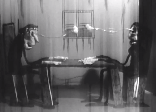
From “Eye Contact” a creepy-fun stop-motion animated short by Charles Pieper.
Eye contact is such a seemingly small and obvious thing. After all, it’s just looking another person in the eye with some modicum of intentionality and regularity, right? Yet, many super smarty pants people often neglect to give good eye contact when conversing—and especially when presenting. That’s a real shame because bad eye contact can obscure and undermine the smart stuff smart people say.
Consider some of the benefits of good eye contact:
We tend to trust people more who look us in the eyes. Lack of eye contact often conveys a lack of confidence.
It’s one of the easiest way to gain a person’s attention. Lack of eye contact is an easy way to lose attention.
Eye contact helps put passion and personality into what you’re saying.
Research shows people remember what they hear more with good eye contact than without.
And, as presenters, we often gain reassurance—and confidence—from eye contact too. Most people will reward your eye contact with a nod of acknowledgement or smile a little or give some small sign that you’re connecting.
Sure, there’s such a thing as too much eye contact. Under normal conditions, you probably don’t need to make more than 3–6 seconds of solid eye contact with someone at any given moment. But if you are unaccustomed to making good eye contact, whether conversing or presenting, even 3 seconds may feel quite uncomfortable at first. So, rope a few friends into your uncomfortable world and practice eye contact with them. If a few seconds feels uncomfortably too long, go longer for awhile. It will start to feel less awkward when you back off to a more reasonable amount of time.
There are real risks to not making eye contact too.
Many argued that President Obama’s unexpectedly weak showing at the first Presidential Debate was due in part to hislack of eye contact (or, restatedly, to all that eye contact he gave to the podium). It didn’t lose him an election, but…

At the time, Forbes said:
“However, it was Obama’s obvious lack of eye contact that really hurt him. He routinely looked down, most often at his notes or the floor, while rarely making (let alone holding) eye contact with Romney. Arguably a stronger showing in this one basic skill would have halted such a sweeping victory by Romney.” Forbes 10/16/2012
If you know or suspect that you don’t make good eye contact with your audience when you present, it may help to think about why. Why don’t we all make great eye contact automatically and by default? It’s so obvious and simple after all.
Many of the very things that make eye contact such a powerful part of non-verbal communication can also make giving good eye contact feel intimidating, scary even. If eyes really are the windows to the soul, we may fear what soul we’ll find when we look into another’s eyes. Or, we may be more worried about what our audience will find as they look into our eyes.
Eye contact and confidence are often correlated. The truth is that often people don’t just look insecure in failing to make good eye contact. Often there’s real insecurity inhibiting eye contact. If the source of that insecurity is related to a specific situation or subject matter, it may be easier to find ways to address it than if the source is more free-floating and pervasive within.
Do you get so caught up in thinking about your subject matter that you forget about the “presentation” part of presenting? Most presenters I know (myself included) don’t need to be reminded to spend time working on the content of the presentation. And many of us will continue tweaking our visuals until the last minute. But it’s amazing how few of us remember to give ample practice and attention to the delivery part. You know, the presentation part of our presentation. Frankly, most of us know our content better than the time we put into tweaking it would suggest. And, unless you’re someone like Hans Rosling, the odds are your visuals will be fine—plenty good enough, but not as whiz-bang amazing as we might like.
Is it perfectionism? We’re often our own worst critics. We know what we meant to do. We know what isn’t just so about what we’re about to do or what we just did. The thing is: nobody else knows what you didn’t do. And, the better the connection you have with your audience, the more likely your audience is to give you the benefit-of-the-doubt.
Do you lack confidence or feel insecure when communicating or presenting? And if so, is it because you haven’t prepared your material? Is it free-floating fear/nervousness?
Some reasons are easier to address than others. But you can do it. For many, it’s just practicing—plain and simple. We sometimes spend so much time fiddling with the data and the slides that we give short shrift to the expression. Singing along with the radio is fun, but it doesn’t help you hear what your voice sounds like. So speak your presentation out loud! Record yourself with your smartphone or computer. Then, listen to it. Few truly like the sound of their own voice—mosthate it. But that’s okay. Get over it. If you don’t like what you’re hearing, try making changes and do it again. And. Again.
If confidence is a problem, sometimes things like eye contact can actually help. A smile never hurts either. It’s okay to fake it and force it a little at first. It ultimately depends on what’s driving your lack of confidence. But it’s worth taking the time to figure it out. Odds are that eye contact isn’t the only thing suffering from the insecurity.
So, yeah. It’s important to make good eye contact when you communicate, when you present. It can make a big difference for better or for worse whether do. If it doesn’t feel natural to make eye contact, it really is worth figuring out why and then taking the necessary steps for improvement.
Eye contact and other non-verbal communication skills feature prominently in all of the presentation skills training ZEHREN♦FRIEDMAN offers. Their training even helps folks learn techniques to practice and improve outside the classroom. But you can make great strides just taking a little time working on your eye contact—practice with friends, practice in front of a mirror, record yourself.
It all starts with you. Doesn’t it always? ;-)
This was the fourth and final post in a series on The Top 4 Challenges Tech Presenters Face.
The first three challenges were:
Related Courses:
HT3M2: Helping Techs Talk To Mere Mortals is a course built to help technical and analytical people present better—especially to the less technical and analytical "mere mortals".
Professional Presentation Skills focuses on two major issues: how to organize a presentation and how to deliver it most effectively.
ZEHREN♦FRIEDMAN can help your data denizens and science sleuths be more effective communicators with a presentation skills seminar designed specifically for technical presenters: “Helping Techs Talk to Mere Mortals” is a two-day, highly experiential, hands-on seminar for six to ten people.
Contact ZEHREN♦FRIEDMAN for more information. Or read more about other Presentation Skills courses.
Jamie Fillmore is a graphic design and technology consultant.


